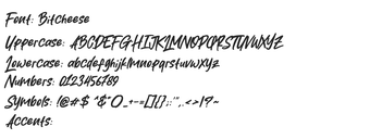
Bitcheese, from Bitcheese, is a pixel-style typeface that adapts 8-bit aesthetics for modern desktop and game interfaces. It renders compact, blocky letterforms intended for interface text and pixel art, emphasizing visual clarity at small sizes. The design balances geometric construction and consistent stroke weight for crisp output, aimed at indie developers, pixel artists, and designers who need faithful, micro-sized retro typography in UI and game projects.
How the font preserves shape at tiny on-screen sizes
The font uses pixel-aligned outlines and uniform strokes so glyphs map cleanly to low-resolution grids. That construction reduces anti-alias blur by matching strokes to device pixels rather than relying on fractional outlines. For designers this means symbols and letters hold their intended blocky proportions when displayed at micro point sizes, making the font suited to small UI labels and in-game HUD elements that need strict geometric rhythm.
How straightforward installation and web use are
Installation follows a standard desktop workflow: extract the distributed file and install the font file to make it available system-wide. For web projects, the font can be converted into browser formats such as WOFF or WOFF2 and embedded via Typical use in design suites and text editors requires no special tooling beyond the usual font management steps.
Where the font fits across platforms and pipelines
The font is compatible with common desktop platforms and integrates with engines and editors that accept system fonts, which supports usage in UI mockups and game builds. Its small file footprint helps reduce load times in application bundles and web assets. Designers can drop the font into development pipelines for consistent raster results without adding heavy binary weight to projects.
Who benefits and when to avoid it
The font's playful, blocky personality suits interface controls, title screens, and pixel-art overlays rather than long-form copy or fine-print typography. Its visible grid-based aesthetic makes it a stylistic choice best for projects seeking retro authenticity; projects that require a neutral, high-resolution reading face should pair this with a proportionally readable fallback for extended text passages.
Focused choice for creators who need authentic retro UI typography
The font is a focused option for indie developers and pixel artists who want compact, period-authentic 8-bit type for interface and game use. Because extended character coverage varies between releases, prepare a fallback font for broader language or long-form needs. Practical tip: test the font at actual display sizes early in your workflow and include the font file in your project assets for consistent builds.
Pros
Pixel-aligned outlines keep glyphs visually consistent at small sizes
Designed for small UI use, suitable for HUDs and title screens
Small file footprint reduces load times in bundles and web assets
Cons
Extended character support varies between releases
Not intended for long-form body text or high-resolution typography
Laws concerning the use of this software vary from country to country. We do not encourage or condone the use of this program if it is in violation of these laws. Softonic may receive a referral fee if you click or buy any of the products featured here.